ABOUT
Wells Fargo & Company is an American multinational financial services company headquartered in San Francisco, California, with central offices throughout the United States. It is the world's fourth-largest bank by market capitalization and the fourth largest bank in the US by total assets.
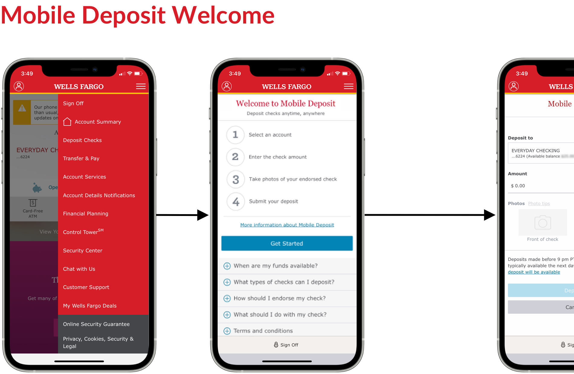
Project: Wells Fargo Mobile® Deposit (iOS + Android)
Timeline: 12 Months
Methods: In-Person, Remote Studies, Iterative Testing
Tools: Sketch, InVision, iRise
My Role: Product UX Design Lead
Results: ⬆ Growth Goals, ⬆ Check Deposits, ⬆ Transactions, ⬆ Monthly Active Users
The Payments team collaborated with cross-functional partners to enhance features in the Wells Fargo Mobile app, with a primary focus on improving the mobile check deposit flow.
The Problem
Customers encountered multiple challenges when using mobile check deposits, leading to frustration and confusion. These obstacles not only negatively impacted the user experience but also contributed to high drop-off rates in key deposit flows and an increase in customer support inquiries. Some key issues included:
• Incomplete check submissions (e.g., unsigned checks)
• Errors during deposit entry, such as mismatched amounts
• Unclear information regarding check processing times and fund availability
Business Impact
These challenges resulted in significantly higher operational costs from increased customer support calls and lower customer satisfaction, which undermined the adoption and effectiveness of mobile check deposits.
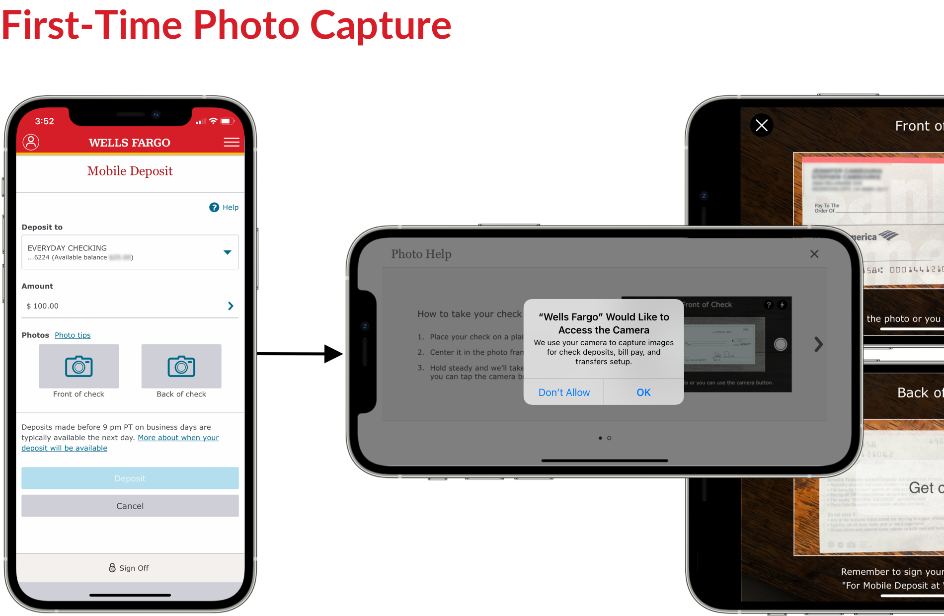
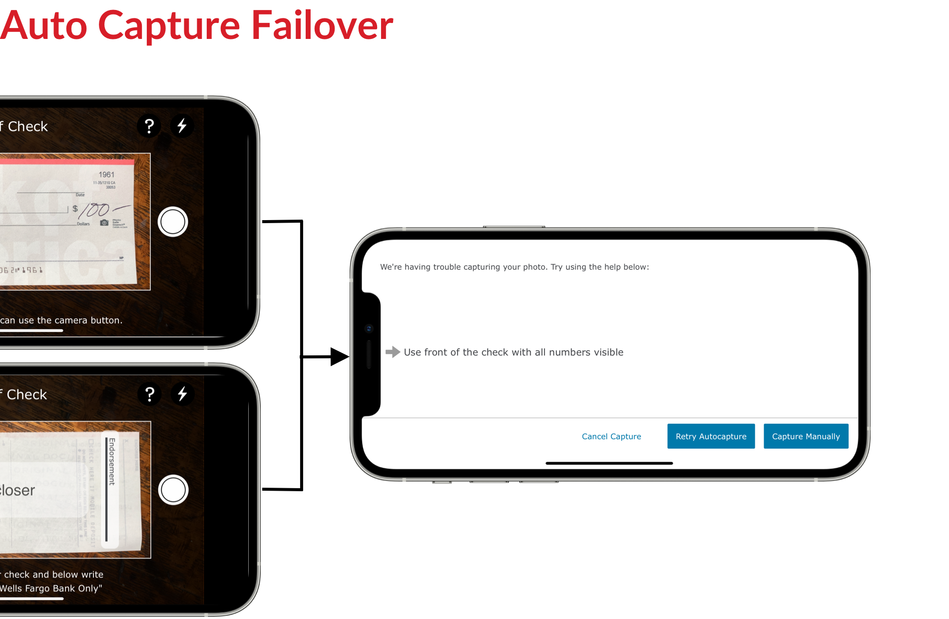
Our objective was to design an end-to-end mobile deposit experience that not only introduced new features to enhance the current flow but also eliminated friction and ensured consistency with the mobile deposit tablet experience. From a technical perspective, we needed to seamlessly integrate the experience with a new check capture SDK, which posed potential complexities and challenges for the team.
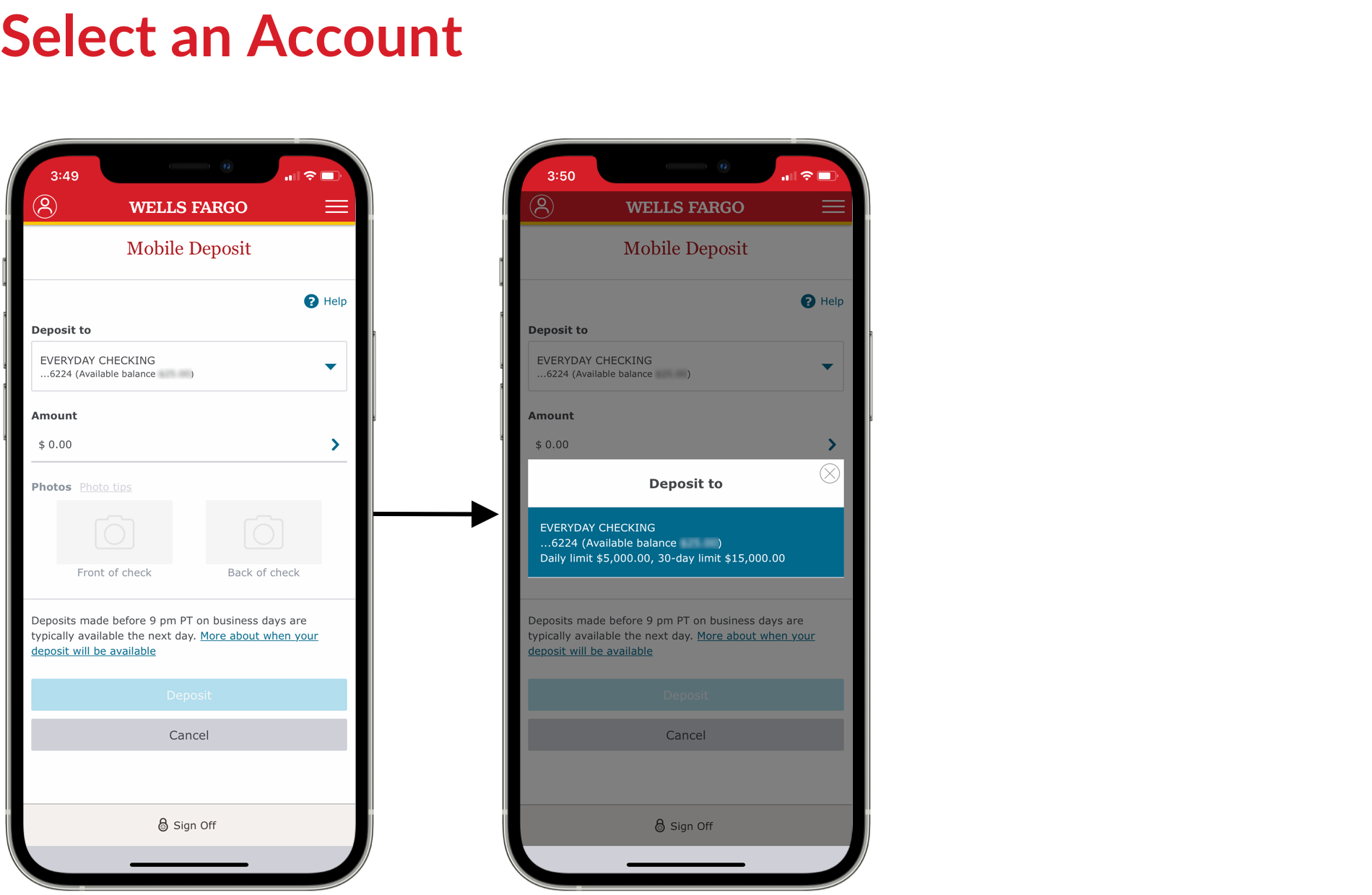
In addition to simplifying the process of selecting accounts, entering amounts, capturing check images, and successfully completing deposits, we aimed to drive higher adoption rates, increased usage, and improved customer satisfaction.
My initial goal was to assess the current experience within the Wells Fargo mobile app and understand how it was serving customers. We reviewed and analyzed existing design artifacts, including customer personas, journey maps, user flow diagrams, past usability testing reports, and other product insights and reports.
We also reviewed direct feedback from the call center to identify common user pain points. Additionally, we conducted interviews with product owners and developers to gain a deeper understanding of the product roadmap, future states, technical constraints, and potential implementation challenges.
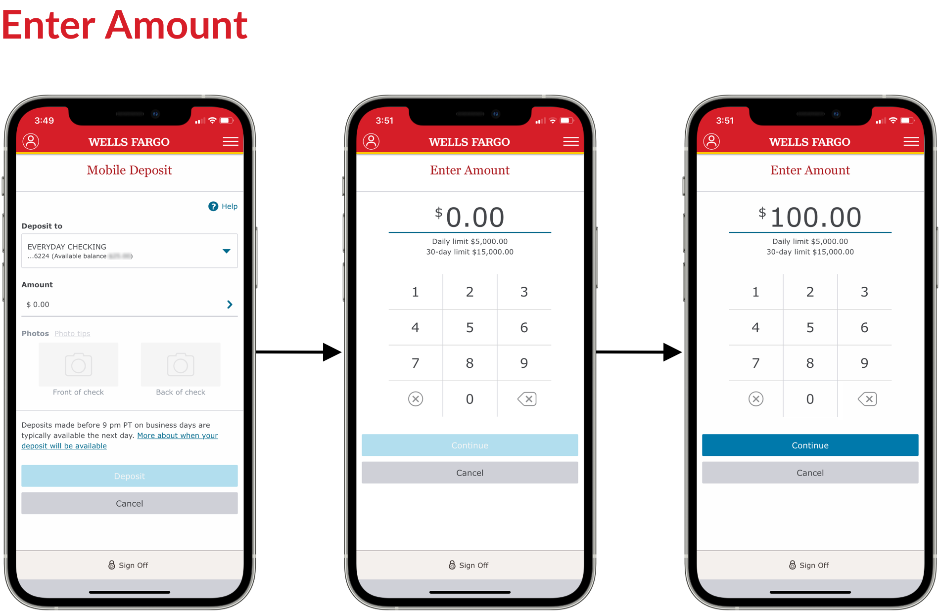
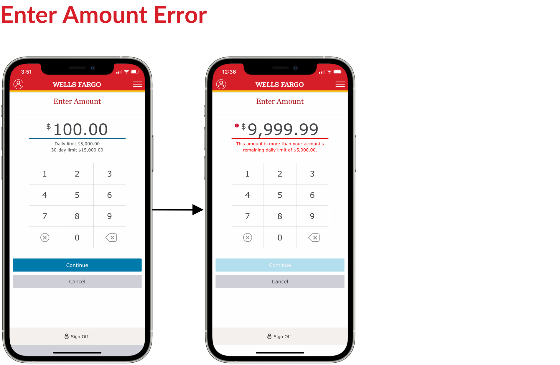
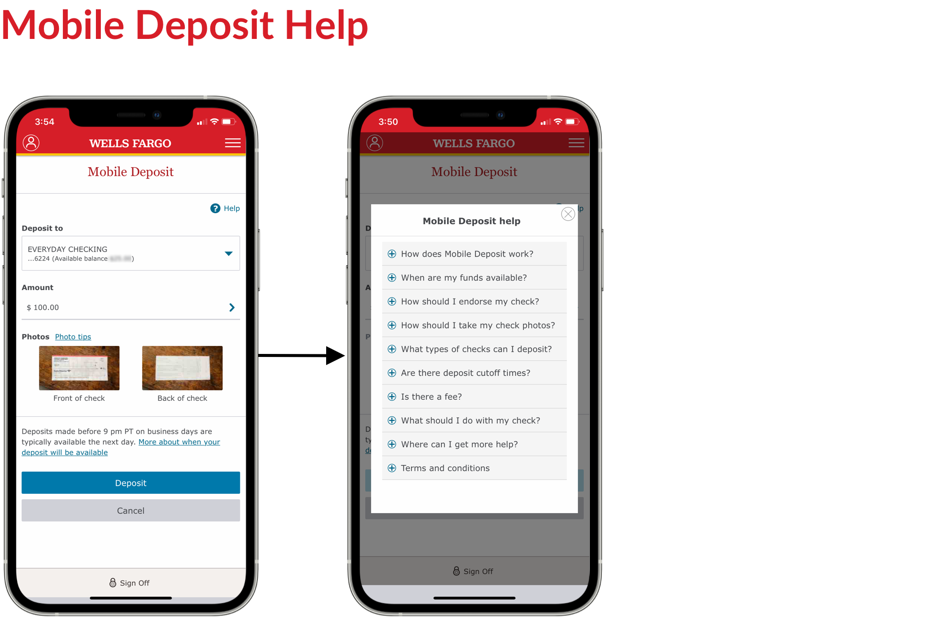
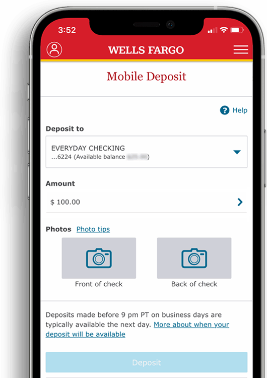
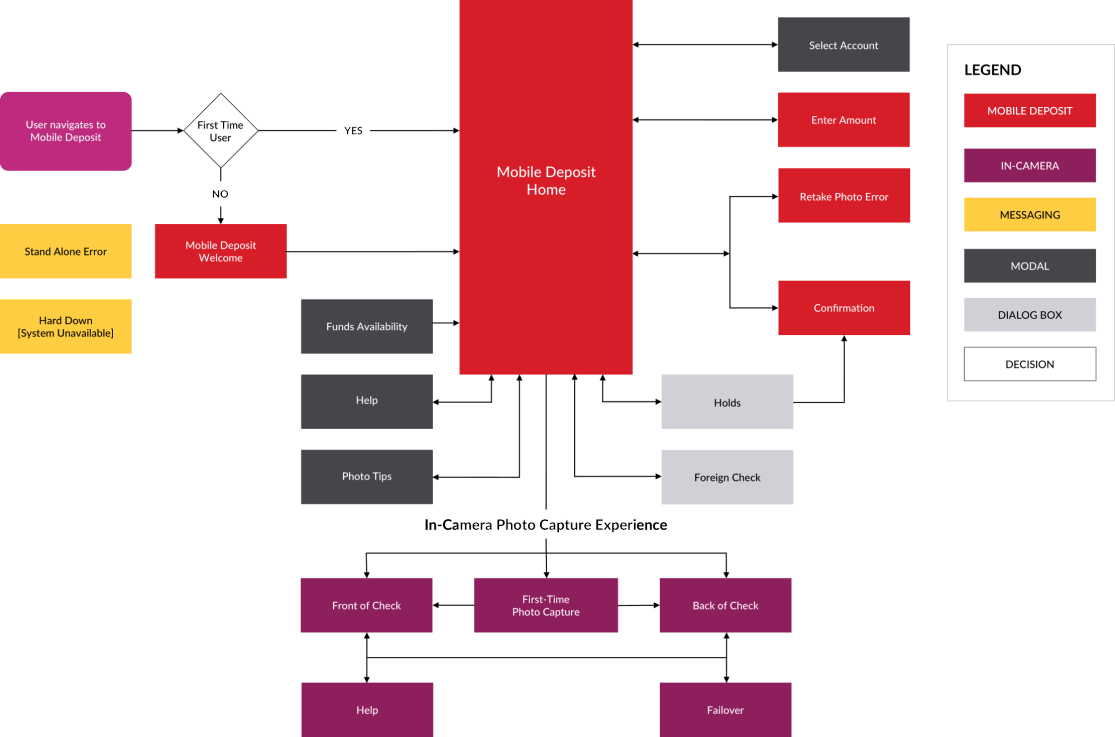
The Problem
Research revealed that customers struggled with the "enter amount" field during mobile check deposits. The small display size made it difficult for users to input, view, and confirm their deposit amounts, leading to frequent error messages due to mismatches. This created both emotional and cognitive friction, as well as an increase in customer service calls from users trying to correct or adjust their deposit amounts.
The Solution
To address this issue, we proposed, designed, and tested a redesigned "Enter Amount" screen that improved usability. This new design not only streamlined the flow for mobile check deposits but also served as a reusable UI component, ensuring a more consistent and enhanced experience across other payment products, such as Transfer Money.


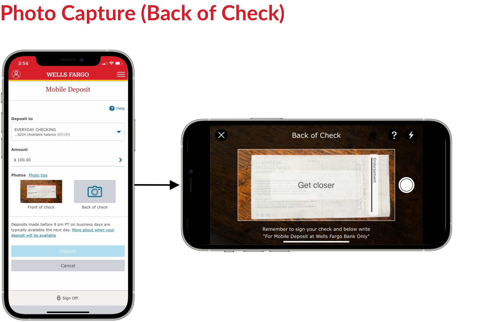
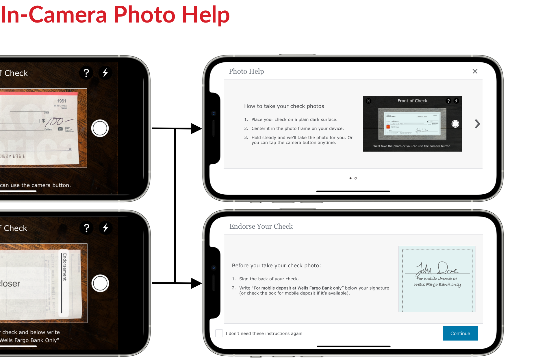
The Problem
When customers deposit checks, they must sign and endorse the back with "For mobile deposit at Wells Fargo Bank only" to ensure the check is accepted and not returned. During usability testing, we identified a key drop-off point in the flow where users either failed to sign or didn’t endorse the check correctly, leading to potential issues with the deposit.
The Solution
To address this, we proposed, designed, and tested a full-screen overlay that appeared during the photo capture process (between the “Front of Check” and “Back of Check” steps). This overlay reminded users to add the required endorsement. For customers familiar with the process, we provided an option to easily dismiss the reminder by selecting a checkbox (“I don’t need these instructions again”).
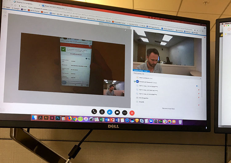
Testing Approach
Our goal was to identify pain points, uncover opportunities, and determine which design elements were valuable enough to move into the product backlog. We tested five participants on a range of new screens and UI enhancements to gather feedback. The testing was conducted using both in-person (moderated) and remote (unmoderated) methodologies.
Key Findings
The results showed high task completion success rates and positive user acceptance, with no major usability issues. We followed up by reviewing feedback and making recommendations for actionable design changes based on user insights.


The Mobile Deposit product surpassed its 10% YOY growth goal, achieving an 11.4% increase with 80.6 million deposits in 2018. Penetration reached a record 30.2%, exceeding 28% for the first time, while YOY transaction volume grew by 13.5%. UX/UI design improvements contributed to record-high check image acceptance rates of 91% (iOS) and 88% (Android) by year-end. The total percentage of check deposits also reached an all-time high of 19.3%, marking a 4% YOY increase. Additionally, the product saw a record 5 million 90-day active customers, reflecting a 16.9% YOY growth.
Schwab Mobile, Positions Transfer (iOS + Android)
Wells Fargo Mobile® Deposit
(iOS + Android)
Wells Fargo Mobile® Biometric Sign-On (Android)
2018 Salary Guide responsive digital experience
Emotional Intelligence at Work responsive digital experience
Responsive website redesign
Responsive website redesign
MeshConnect™ / ZigBee Solutions email marketing program
Citta.org celebrity sutra scarves marketing program

Offline Website Maker